


Gebruikershandleiding
Document

Het documenttabblad laat u de documentinstellingen voor elk nummer wijzigen, zoals de lage lichtmodus, tintkleur, lettertype, papierformaat en marges.
Instellingen
U kunt op het moersleutelictoon in de linkerbovenhoek tikken om globale systeeminstellingen te wijzigen voor hoe dit menu zich gedraagt. Dit heeft geen invloed op opmaak per nummer.
Tintmodus
De modus bepaalt de kleuren die worden gebruikt om het nummer op het scherm weer te geven en kan worden gebruikt om het scherm zichtbaarder te maken in verschillende omgevingen of voor gebruikers met visuele stressaandoeningen. Modi veranderen dienovereenkomstig voor Lage lichtmodus. Als geen optie is geselecteerd, geeft OnSong het nummer weer met standaardinstellingen. Opties zijn:
- Papier geeft het nummer weer in hoog contrast zwart en wit.
- Gedimd geeft gelijk aan papier weer, maar met lager contrast.
- Sepia geeft gelijk aan gedimd weer, maar met warmere kleurtonen.
- Hemel geeft het nummer weer door een blauw tint eroverheen te leggen om te helpen bij visuele stressaandoeningen.
Lage lichtmodus
Rechts van de modusknoppen bevindt zich een pictogram waarmee u de lage lichtmodus kunt in- en uitschakelen. Dit wordt systeemwijd ingesteld wanneer u het in- of uitschakelt en u zult merken dat het ook die wijzigingen toepast op de modus die we hebben geselecteerd. Dit is van invloed op alle nummers en menu's in OnSong.
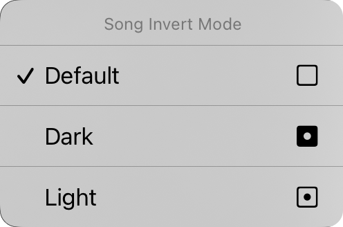
U kunt ook op de knop voor lage lichtmodus tikken en vasthouden om het contextmenu Nummeromslagmodus weer te geven. Van hier uit kunt u de lage lichtmodus voor het specifieke document wijzigen. Dit is standaard ingesteld op "standaard", wat betekent dat het nummerdocument deelneemt aan de lage lichtmodus wanneer deze in het systeem verandert. U kunt het nummerdocument hier onafhankelijk van de lage lichtmodus van de app dwingen om in donkere of lichte modus te worden bekeken.
Lettertypefamilie
Vijf knoppen aan de bovenkant van het menu laten u het lettertype van het gehele nummer kiezen. U kunt kiezen uit:
- Schreefloze is een lettertype zoals Helvetica dat perfect is voor het weergeven van akkoordschema's. Standaard.
- Schreef is een lettertype zoals Georgia dat voor sommige gebruikers gemakkelijker te lezen is.
- Handgeschreven is een lettertype zoals Marker dat erg smal is, waardoor meer inhoud op de pagina past.
- Monospace is een lettertype met vaste breedte zoals Courier dat in sommige gevallen nuttig is voor het uitlijnen van akkoorden.
- Aangepast geeft een beletselteken weer waarmee u lettertypen die op uw apparaat zijn geïnstalleerd kunt bladeren en kiezen. Telkens wanneer u deze optie selecteert, verschijnt het scherm Aangepast lettertype opnieuw voor selectie.
Regelafstand
Als u meer op het scherm wilt passen, overweeg dan om de regelafstand of de ruimte tussen regels te verkleinen. U kunt ook de regelafstand vergroten voor meer ruimte tussen regels voor betere zichtbaarheid. U kunt op de pictogrammen links en rechts van alle schuifregelaars tikken om elke waarde fijn af te stellen. Past tussen 0,7 en 1,3 regels. Standaard is 1,0.
Papier
Hiermee kunt u de grootte van de virtuele pagina instellen, wat van invloed is op de grootte van de lettertypen die u selecteert. Bijvoorbeeld: grotere papierformaten geven lettertypen in een kleinere grootte weer. Met de pictogrammen aan de rechterkant kunt u kiezen tussen staande en liggende richting.
Indeling
De sectie Indeling laat u bepalen hoe elke pagina van het document wordt weergegeven wanneer u de R2-renderingengine gebruikt. Dit heeft drie besturingselementen:
Paginering
Hiermee kunt u het schema naar beneden op de pagina laten stromen met een doorlopend scrollend vel, of de pagina opsplitsen in virtuele vellen papier.
Kolommen
Met dit besturingselement kunt u kiezen tussen een en twee kolommen. Wanneer twee kolommen ingeschakeld zijn, worden de secties van uw nummer naar de andere helft van het vel gestroomd.
Tussenruimte
Dit is de breedte van de tussenruimte, de ruimte tussen de kolommen. Opties zijn van 0" tot 1" in stappen van 1/16".
Marges
Marges laten u een inzet aan de randen van het virtuele papier op het scherm toevoegen. Dit is nuttig om tekst zichtbaar te maken en ruimte te bieden voor Hete hoeken of Navigatiezones wanneer u ook sectieselectie gebruikt. Het pictogram aan de rechterkant toont wanneer marge is gewijzigd: links, rechts, boven of onder.
Voettekst
Hiermee kunt u de grootte van de voettekst instellen als een percentage van de lyrieklettertypegrootte. U kunt ook de knop aan de rechterkant gebruiken om de voettekst in of uit te schakelen.
Alle besturingselementen op dit tabblad, behalve de lage lichtmodus, gelden voor het geselecteerde nummer. We zullen in een moment zien hoe we onze wijzigingen kunnen toepassen op verschillende nummers in onze bibliotheek.
U kunt de standaardwaarden van elk aspect van het document wijzigen door op het moersleutelictoon in de linkerbovenhoek te tikken om toegang te krijgen tot de opties Stijlvoorkeuren Document.


