


Read The Bleepin’ Manual
The Thing You're Lookin' At

The doc tab lets you tweak the look of each song—dark mode, tint vibes, fonts, paper size, margins. Y'know, the important stuff.
Fiddle With It
Tap that wrench icon in the top-left corner to mess with the global system settings for how this whole thing behaves. Spoiler: it won't touch your per-song formatting. You're welcome.
Tint Mode
The mode picks the colors OnSong uses to paint your song on screen & can help make things readable when you're in a bright room, a dark room, or just havin' eye stress feels. Modes shift automatically for Low Light Mode. If you don't pick anything, OnSong's like "fine, default it is." Your options:
- Paper = high contrast black & white. Boring but readable.
- Dim = like paper, but less angry at your eyes.
- Sepia = dim with warm fuzzy tones. Very vintage. Very you.
- Sky = blue tint overlay to chill out visual stress. It's basically the app's emotional support.
Low Light Mode
To the right of the mode buttons is an icon to toggle low light mode on & off. Change this & it updates system-wide—all songs & menus in OnSong feel the love. Totes convenient.
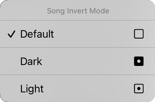
Tap & hold the low light button & you'll get the Song Invert Mode context menu. From here you can force a specific song into dark or light mode, no matter what the app's doing. Set it to "default" & the song will just go along with whatever the system's feelin'. Rebel mode unlocked.
Font Family
Five buttons at the top let you pick the font for the whole song. Choose your fighter:
- Sans-Serif = Helvetica-y goodness. Perfect for chord charts. It's the default because we know best.
- Serif = Georgia-style fanciness. Some peeps find it easier to read. We don't judge.
- Handwritten = Marker-ish narrowness. Fits MOHR stuff on the page. Space-savin' legend.
- Monospaced = Fixed-width Courier vibes. Useful for chord alignment nerds.
- Custom = Pick literally any font your device has hiding in there. Every time you tap it, the Custom Font screen pops up again. Riveting.
Line Spacing
Wanna cram more onto the screen? Shrink the line spacing. Or go the opposite direction if your eyes need a vacation. Tap the icons on either side of the sliders to fine-tune like a bleepin' perfectionist. Range: 0.7 to 1.3 lines. Default: 1.0.
Paper
Sets the virtual page size, which messes with your font size. Bigger paper = smaller fonts. The icons on the right flip between portrait & landscape. Revolutionary stuff.
Layout
This section controls how each page flows when you're rockin' the R2 Rendering Engine. Three controls, here we go:
Pagination
Scroll forever like a never-endin' sheet, or break it into pretend pages. Your call, smarty.
Columns
One column or two. Two columns = song sections flow to the other half. Space-efficient. We're geniuses.
Gutter
The gap between columns. 0" to 1" in 1/16" increments. Because precision matters... or something.
Margins
Margins = insets on the edges of your virtual paper. Great for keepin' text visible & makin' room for Hot Corners or Navigation Zones when you're feelin' fancy. The icon on the right shows which margin you just changed: left, right, top, or bottom.
Footer
Set the footer size as a percentage of the lyrics font. There's also a button to toggle it on & off. Wild.
Everything on this tab except low light mode applies to just the one song you picked. We'll show you how to spread the love to other songs later.
Wanna change the default values for literally everything? Tap that wrench icon & head to Style Preferences Document options. You got this.


